
A girls trip to Charleston, planned by a friend who has loved it for years, which meant expectations were quietly high from the start. Not in a checklist kind of way, but in the I know this place is going to wow me kind of way.
And it did.
Not because of any one landmark or “must-see,” but because of how consistent everything felt. Charleston has a way of holding onto itself. The materials, the scale, the color, nothing feels accidental.
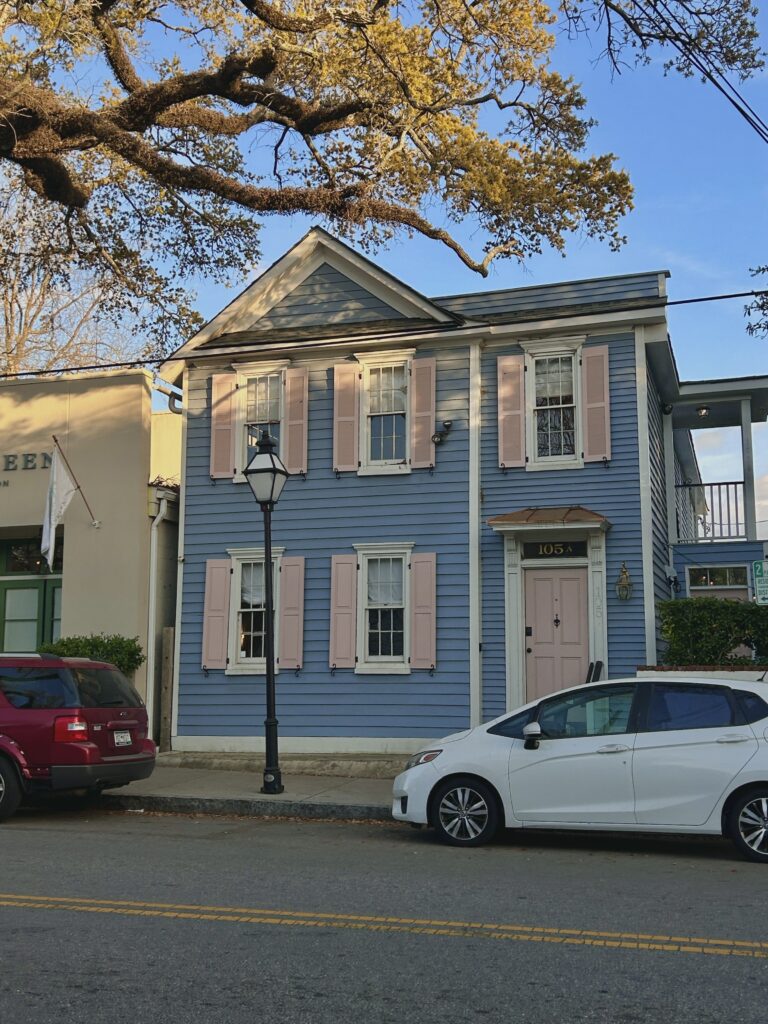
First Impressions, Folly Beach
Our first stop was Folly Beach, at Sun & Ski Beach. Frozen drinks, fish tacos, ocean in full view.
But what stuck with me wasn’t the menu, it was how soft everything felt. The sun-washed color palette, slightly faded pastels, bleached woods, nothing too sharp. Even the way the buildings sit back from the water, like they’ve learned not to compete with it.
There’s a restraint there that feels very coastal, but not overly styled. Just worn in the right way.
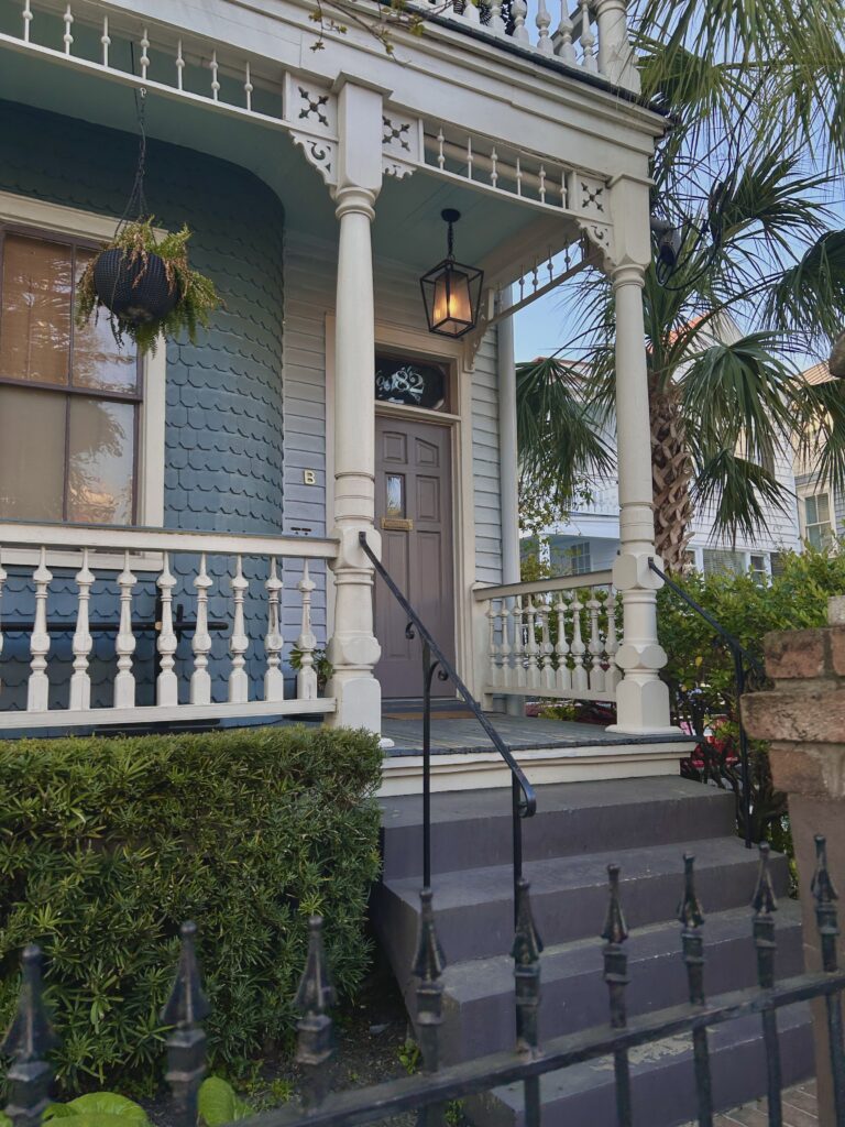
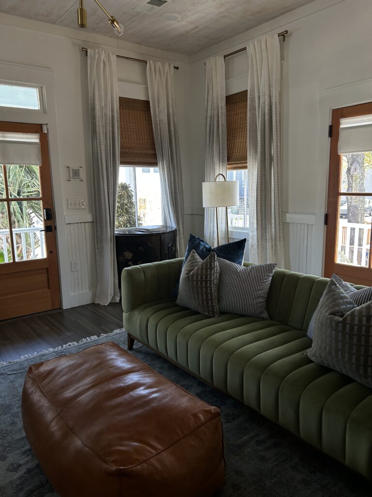
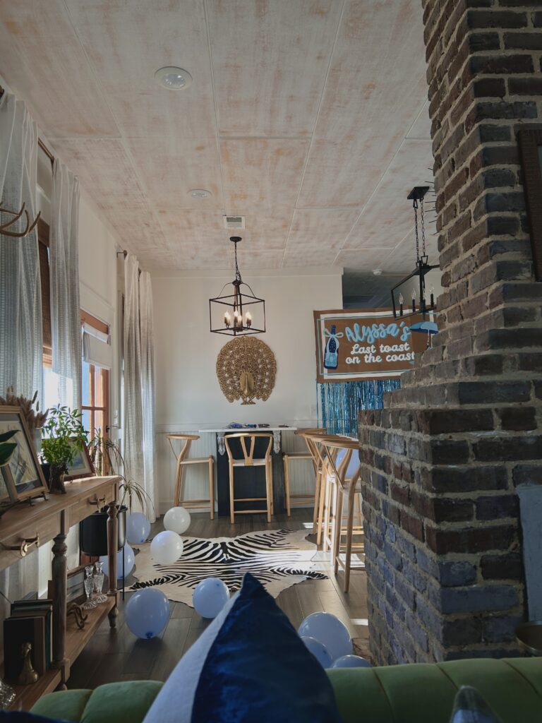
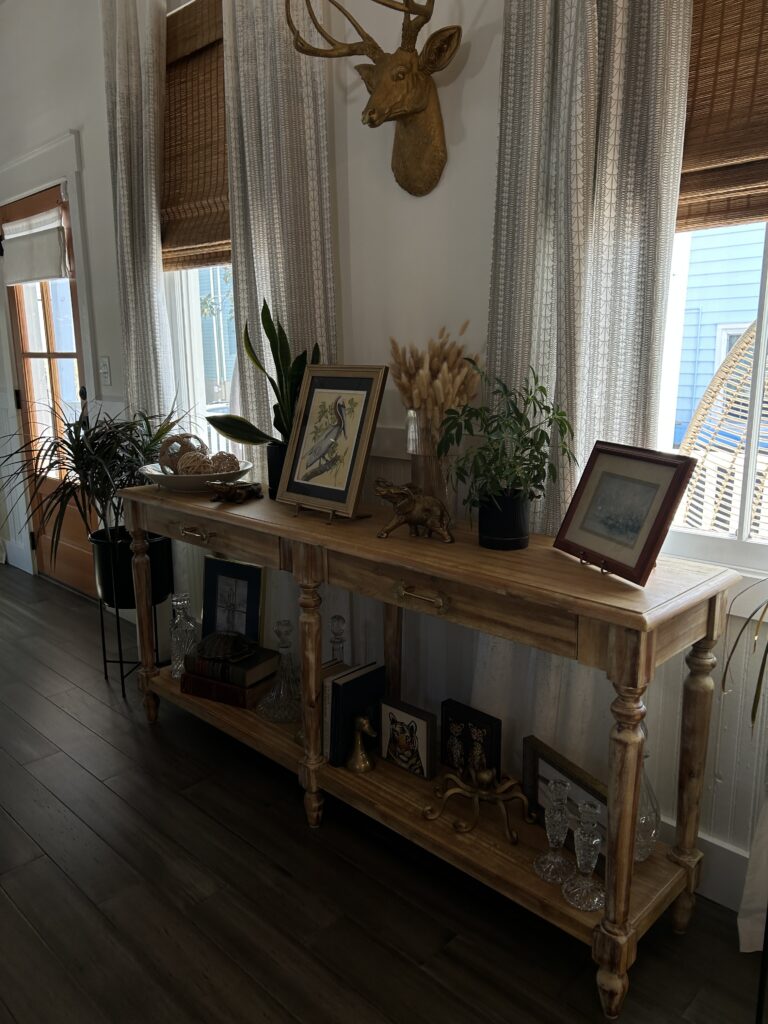
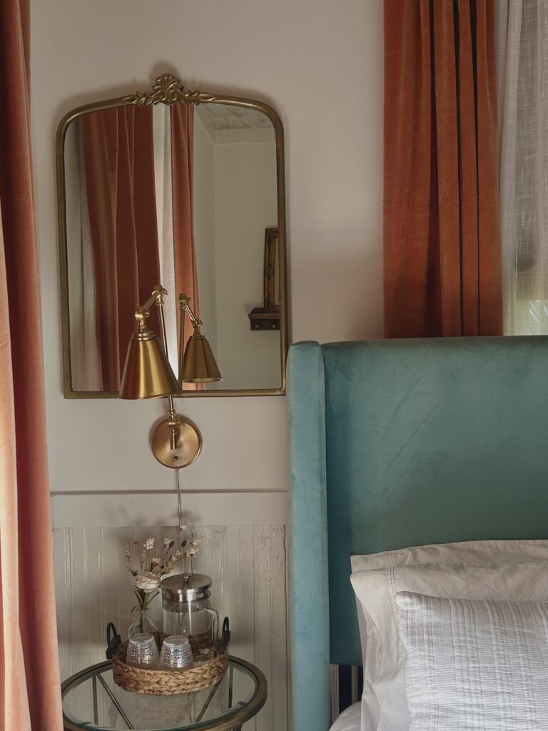
The Airbnb (of course it mattered)
We all met in design school, so naturally, where we stayed mattered.
And this house understood Charleston.
Moulding everywhere, but not overly precious. Bold color, but grounded. Layered drapery that actually felt intentional, not just added for softness. It had that collected-over-time feeling without looking cluttered.
The accessories were what really made it. Nothing loud, but everything placed with confidence. It felt like someone knew exactly when to stop.
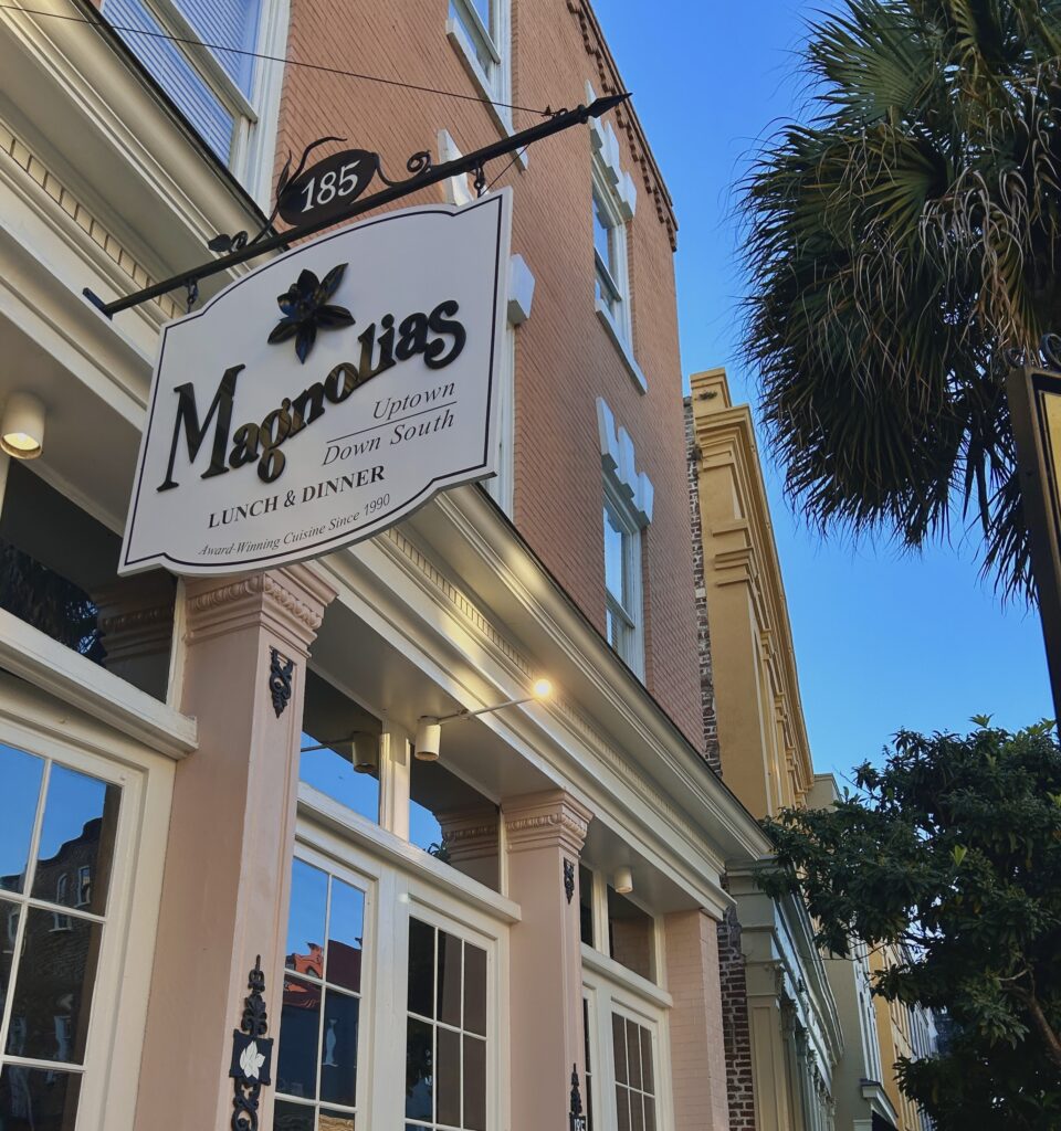
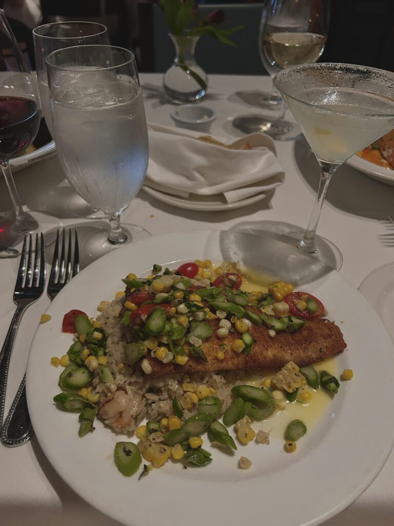
Dinner at Magnolias
Dinner at Magnolias in the French Quarter felt like stepping into a version of Charleston that leans a little more polished, but still grounded.
Warm lighting, deeper tones, a little more contrast. It didn’t try to feel trendy, which is probably why it works.
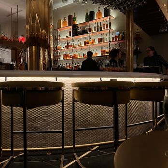
After, drinks at the lobby bar at The Palmetto Hotel.
And this is where Charleston really shows off. The layering, the texture, the mix of old and new without forcing it. Nothing felt over-designed, which ironically makes it feel more designed.
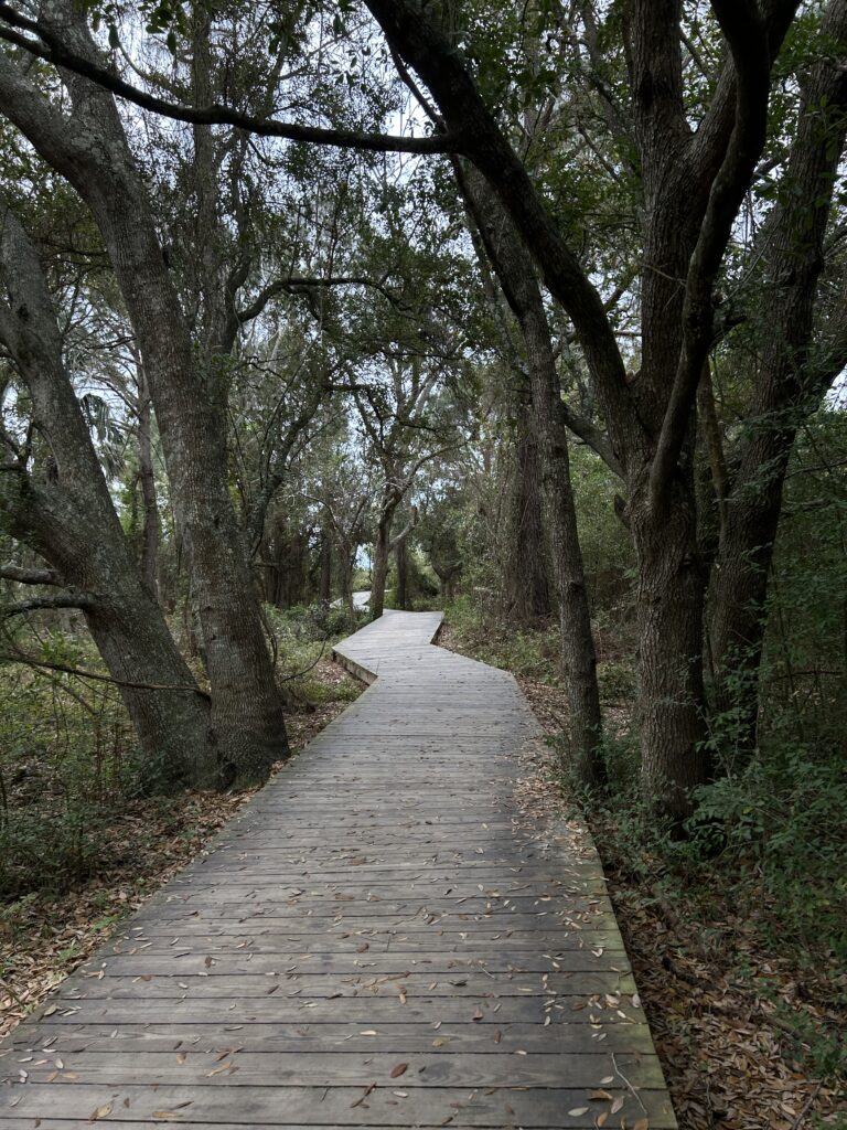
Water, Space, and Kiawah
The next day was a boat ride out to Kiawah Island.
Kiawah feels different. More restrained, more quiet. The palette shifts into neutrals, sand, soft greens, weathered gray. The architecture pulls back and lets the landscape lead.
It’s a good reminder that not every space needs to speak loudly to feel intentional.
Aesthetic Stops (because we notice everything)
Bourbon N’ Bubbles was high on the list, and for good reason.
It leans fully into its point of view. Saturated color, velvet, shine, a little dramatic, but it commits. And when a space commits, it works.
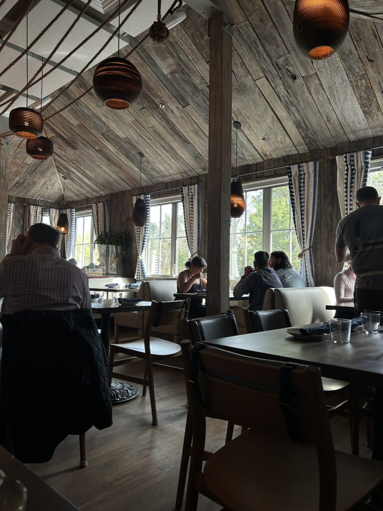
We also found a breakfast spot just a few blocks from the ocean that leaned into rope, sandalwood tones, and that slightly undone coastal texture. The kind of place where materials are doing most of the work.
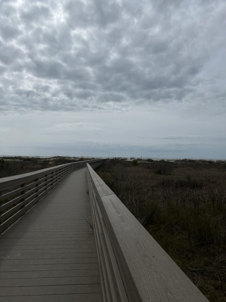
Sullivan’s Island
A full day at Sullivan’s Island, doing very little.
And that’s kind of the point.
Sullivan’s feels quieter than Folly. Less color, more tone. It’s all about subtle variation, texture over contrast. Nothing is trying too hard, and it doesn’t need to.
What Charleston Gets Right
Charleston isn’t about standout moments. It’s about consistency.
It knows its materials. It repeats them in different ways. It doesn’t chase contrast just to create interest, it lets age, texture, and proportion do that work.
And that’s probably why it feels so good to be there.
Nothing is competing for attention.
Everything just… belongs.