
Paint is a Liar: Why Color is Tricky and What to Do About It
There’s always one room that feels off.
You’ve bought beautiful tile, chosen the perfect hardware, even found a sofa you love, but something still isn’t working.
Nine times out of ten, the problem is paint.
Paint seems simple. You choose a color, roll it on, and voilà… right? Not quite. Paint is one of the most misunderstood (and most impactful) design decisions you can make. And if you’ve ever picked a color that looked dreamy on the swatch but turned baby blue on the wall, this post is for you.
Undertones Are Everything
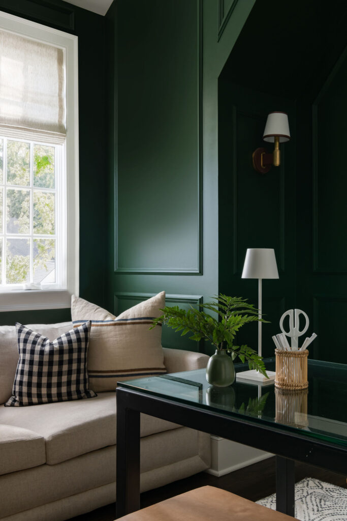
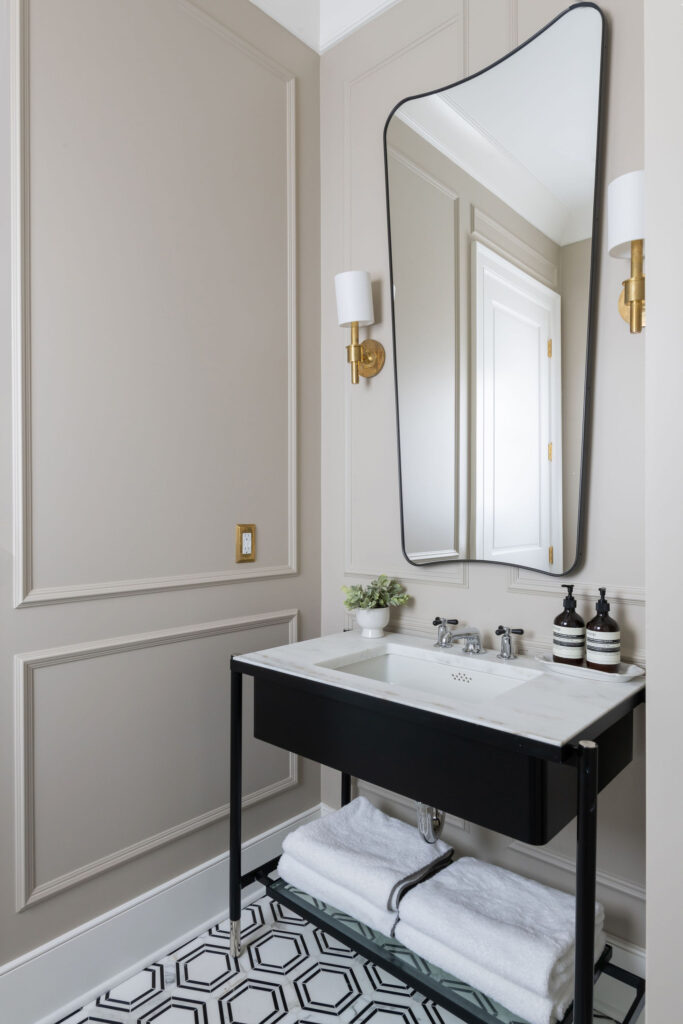
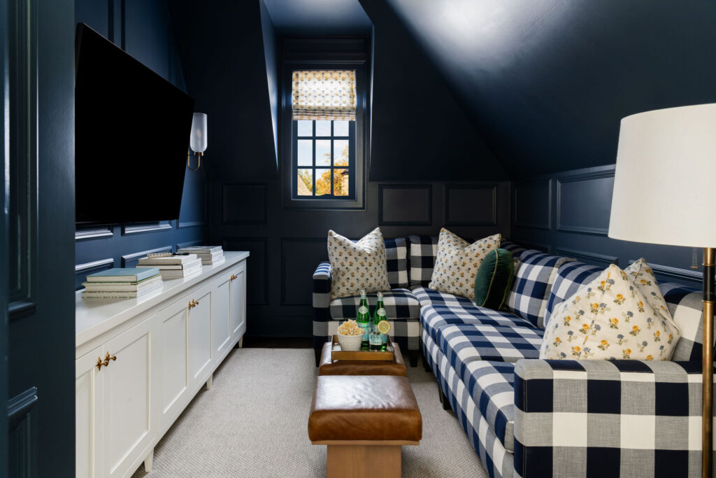
The biggest lie paint tells is in the undertone. A white isn’t just a white. It might carry a yellow, pink, blue, or green undertone that shifts dramatically depending on what’s around it, your floors, cabinetry, natural light, even the tree outside your window. That “clean neutral” you loved might suddenly feel muddy or cold when it’s up on the wall.
I’ve seen this happen even with clients who swore they tested their paint. Which brings me to the next lie…
Paint Samples on the Wall Are a Trap
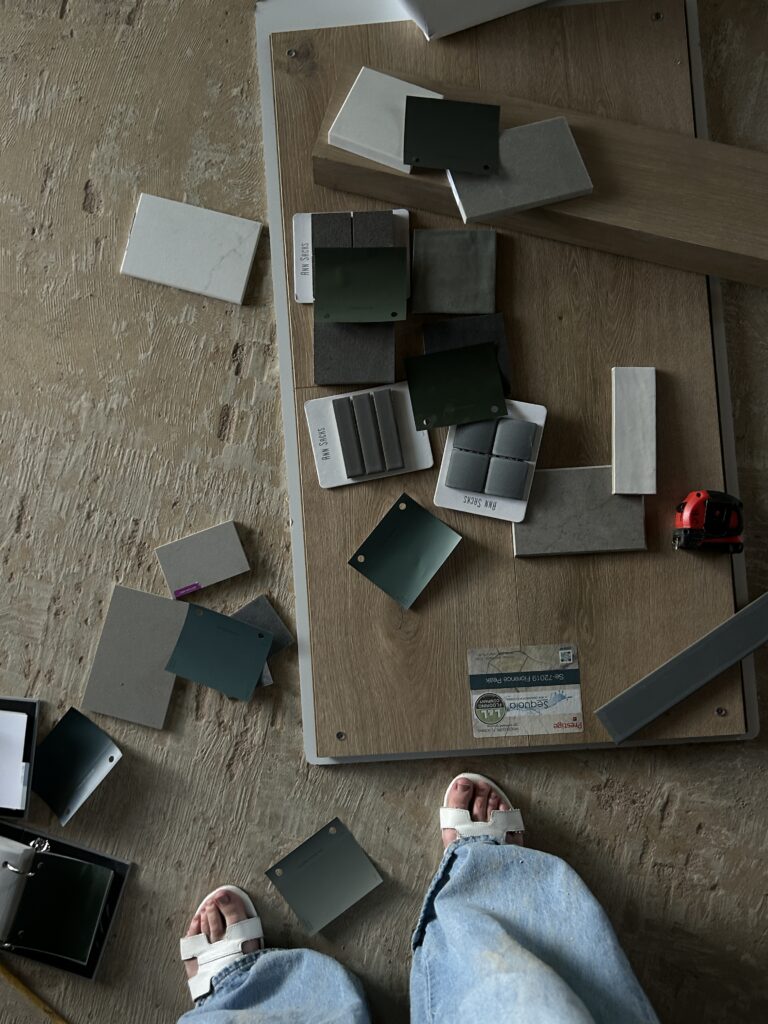
I know it’s tempting to buy those little sample pots and slap color options on the wall. But here’s the thing, those samples are watered-down versions of the real paint, and the existing wall color always bleeds through. That throws off the undertone and the finish, making it nearly impossible to get a true read on how the color will behave.
Instead, I use 8.5″x11″ paper paint sheets. These are true-to-color and let us move the sample around without the existing paint interfering. I tape them up in two different spots, usually one that gets direct light and one that stays a bit shadowed, and I always tell clients:
Look at it in the morning, mid-day, and evening.
The color will shift throughout the day, and you want to love it in every light.
Finish Matters (More Than You Think)
Another common mistake? Choosing the wrong paint finish.
Please don’t use flat paint on your walls. And please don’t do high-gloss unless you’re painting a piano.
For walls, I always recommend eggshell or satin. It gives you just enough sheen to reflect light and clean easily, without calling too much attention to imperfections.
For trim: satin or semi-gloss, something that creates a subtle contrast and holds up to scuffs.
Flat paint may hide imperfections in theory, but it ends up looking chalky and lifeless. And high-gloss? Unless you’re going for drama (and I mean drama), it’s just not worth it.
Need Help Choosing the Right Color? I’ve Got You.
I offer personalized color consultations for clients who are stuck, or who want to make sure their home has a cohesive, polished look from room to room.
If you’re standing in the paint aisle texting five different friends, squinting at a swatch that looked beige yesterday and green today… take a deep breath. Let’s pick the right color the first time.
Send me a message and we’ll schedule a time to walk through it together.
